Script style
Cursive Calligraphy
See the cursive calligraphy alphabet from A to Z in three script styles, then turn any word or name into a free trace practice sheet in the same font.
Cursive calligraphy alphabet A to Z
Each chart shows the full uppercase and lowercase alphabet in one script font on warm paper. Use a chart as a reference while you write, print it for your desk, or open the same letters as a trace worksheet. The letters come from fonts, so every letter has one fixed shape; written calligraphy changes slightly from one stroke to the next.
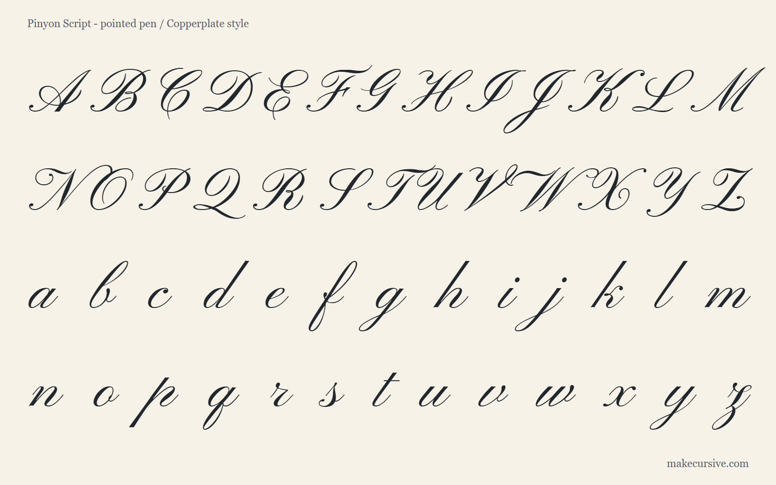
Pointed pen: Pinyon ScriptClose to Copperplate, with a steady slant, oval loops, and hairline upstrokes, so it suits wedding invitations, place cards, and formal names.
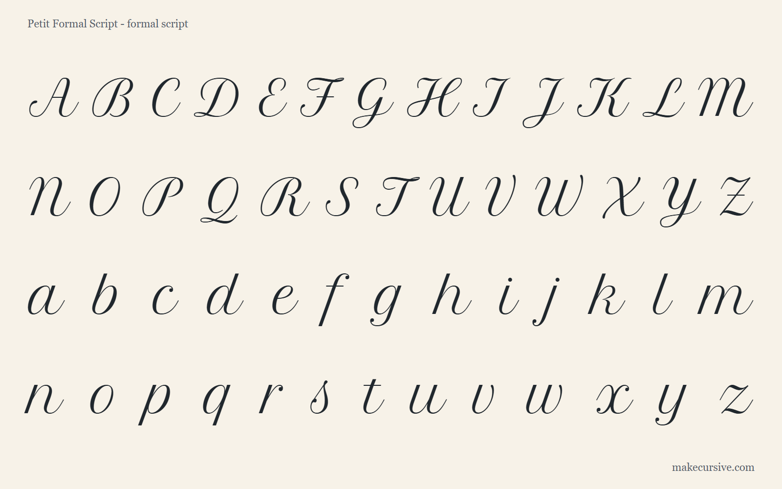
Formal script: Petit Formal ScriptRounder and more upright, with gentle contrast that stays easy to read, so it works for certificates, menus, and labels people need to read quickly.
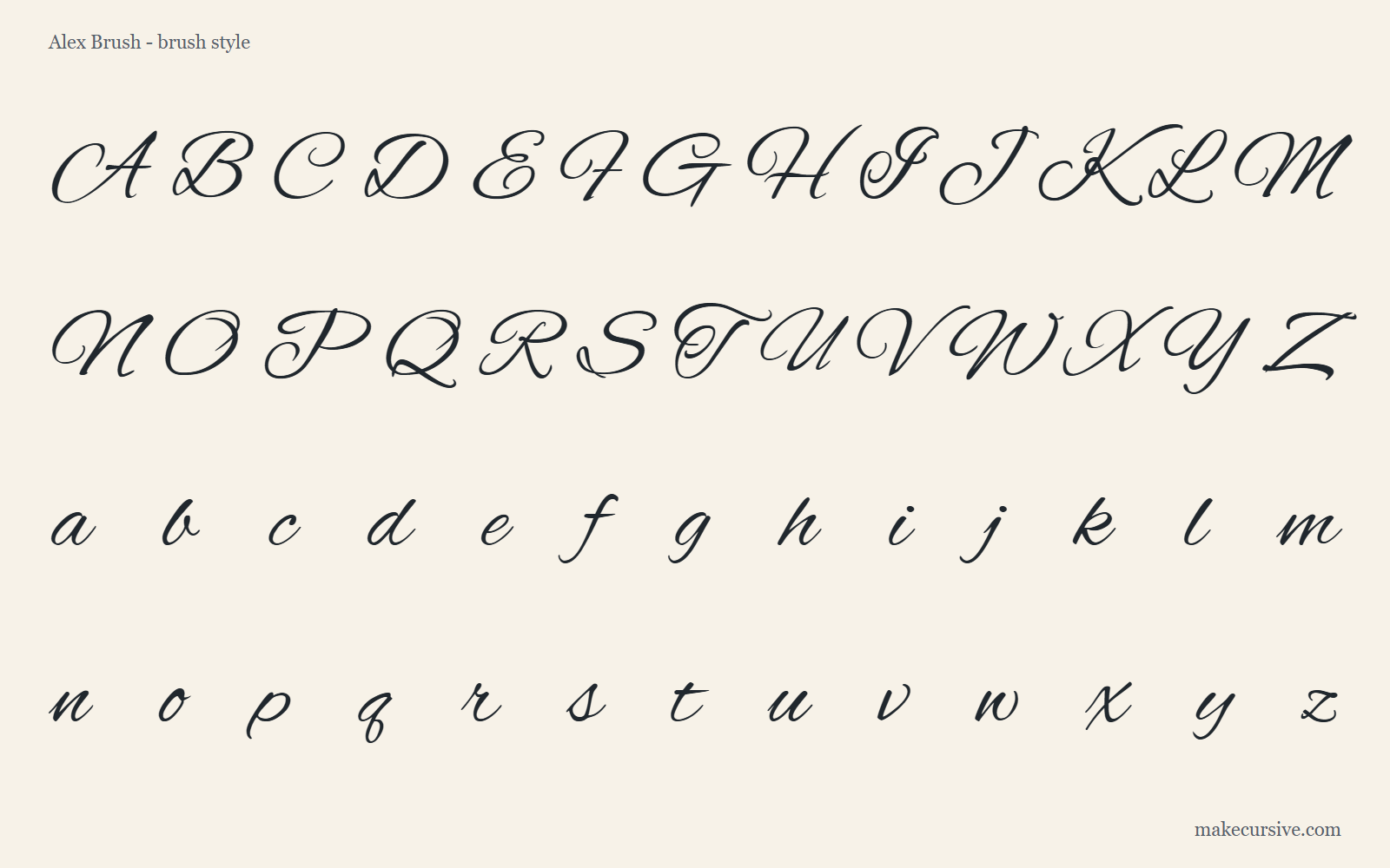
Brush lettering: Alex BrushLooser, bouncier strokes that look like a brush pen, so it suits greeting cards, signs, and social graphics where a relaxed look fits.
Turn your word into a calligraphy practice sheet
Type a name, a date, or a short phrase, pick one of five calligraphy fonts, and check the preview. The button opens the worksheet generator with your word already set out in trace rows, ready to print.
Prefer to set every option yourself? Open the full cursive worksheet generator for practice sheets, or the cursive generator to compare more script fonts as images.
The practice sheet is free and needs no signup. You can print it straight from the browser or download it as a PDF, and change the guide lines, row count, and paper size first. The font only shows the target letter shapes: it does not teach stroke order or where to lift the pen. For that, follow How to write in cursive.
Three common calligraphy looks
When someone asks for "cursive calligraphy", they usually mean one of these styles. Knowing which one you want makes it easier to choose a font for a preview or a pen for practice.
Pointed pen: Copperplate and Spencerian
Pointed pen scripts are written with a flexible metal nib in a holder, dipped in ink. Pressing on the downstroke spreads the nib and makes a thick line; releasing pressure on the upstroke gives a hairline. Copperplate (also called English roundhand or engrosser's script) has a strong, consistent slant, oval shapes, and noticeable shading on most downstrokes. Spencerian is lighter and more delicate, with less shading and more emphasis on graceful, elongated ovals. Both are the ancestors of the formal "wedding invitation" look.
See the pointed-pen alphabet in Pinyon Script, or the rounder Petit Formal Script alphabet.
Brush lettering
Brush lettering uses a brush pen or a real brush. The contrast comes from the same pressure principle, but the strokes are wider and the result looks bolder and more casual. Modern brush lettering often lets letters bounce above and below the baseline, and many letters are not fully joined. It is popular for cards, signs, and social graphics.
See the brush-style alphabet in Alex Brush.
Monoline and "faux" calligraphy
Monoline script keeps the same line weight throughout, like a neat, slow version of cursive. Faux calligraphy starts from monoline writing and then adds a second line beside each downstroke and fills the gap, imitating pointed-pen contrast with an ordinary pen. It is the easiest place to start because it needs no special tools.
Write any word in monoline first, then make a trace sheet for it and add the thick downstrokes by hand.
What the generator can and cannot do for a calligraphy look
Make Cursive renders your text in existing script fonts. That is useful for previewing and exporting a word, but it is not the same as writing calligraphy.
What works well
In image mode, the Formal and Elegant categories include fonts with pointed-pen contrast, such as Pinyon Script, Petit Formal Script, Italianno, Great Vibes, and Alex Brush. The Bold category includes brush-style fonts. You can set size and ink color, then download a PNG or SVG with a transparent, white, or warm paper background.
What it cannot do
It cannot vary pressure, add custom flourishes, swap in alternate letter shapes, or adjust the spacing of one letter pair. Some script fonts do not join every letter. If the word needs a hand-drawn swash or an exact layout, use the export as a sketch reference and finish the design by hand or in a design app.
Copyable text is different
The copy-and-paste "script" styles use Unicode math letters, not fonts. They keep a fixed shape, show no stroke contrast, and may look different in each app. Use PNG or SVG when the calligraphy look needs to stay the same.
A practical workflow for a calligraphy-style word
- Type the exact word or name, including capitals and punctuation. "Mr & Mrs Lee" and "mr and mrs lee" give very different shapes.
- Switch to image mode and filter by Formal or Elegant. Compare three or four fonts rather than scrolling through all of them.
- Set the size close to how large the word will appear in use, then check that tall loops, descenders, and capitals do not collide.
- Choose an export size: Standard (1200 x 420) suits a single word, Wide (1600 x 500) gives long names more room, and Square (1000 x 1000) suits social images.
- Download a transparent PNG for overlays, or an SVG when the word must stay sharp at large sizes. Check the file in the app where you will use it.
- If you plan to letter it by hand, print the word as a calligraphy practice sheet and trace it a few times before writing it freehand.
Practicing calligraphy by hand
A typed preview shows the target shape. Getting your hand to produce it takes short, regular practice. A sensible progression moves from cheap, forgiving tools to more demanding ones.
1. Pencil
Learn the skeleton of each letter: slant, ovals, loop heights, and joins. Draw a few slant lines across the page as guides. A pencil lets you erase and see where the shape goes wrong.
2. Monoline pen
Move to a fineliner or gel pen and write the same words with even pressure. When the shapes are steady, try faux calligraphy by thickening only the downstrokes.
3. Brush pen or pointed pen
A small, firm-tipped brush pen is easier to control than a large soft one. Pointed pen needs a nib, holder, ink, and smooth paper that does not let the ink spread. Practice light upstrokes and heavier downstrokes before full words.
Warm-up drills help with every tool: rows of ovals, slanted downstrokes, and the "push-pull" loop that links letters such as l, h, and b. Ten minutes of drills followed by a few practice words is more useful than an hour of copying long passages. The cursive alphabet chart and the alphabet worksheet PDFs are a good base for the letter shapes themselves.
Practice words for calligraphy style
These words were chosen because each one tests a particular skill. Open any of them in image mode to see the shapes in a script font, then write them by hand. Each word also has a Trace sheet link that prints it in Pinyon Script with trace rows.
Cursive, script fonts, and calligraphy are not the same thing
People often use the three terms interchangeably, which causes confusion when a tool or a tutorial does not match what they expected. The practical difference is how the letters are produced.
Cursive handwriting
Everyday joined writing done with an ordinary pen or pencil. The line has roughly the same thickness everywhere, and the goal is speed and readability. School models such as Zaner-Bloser or D'Nealian teach a fixed set of shapes and joins.
Script fonts
Digital typefaces drawn to imitate handwriting or calligraphy. Every letter is a fixed drawing, so the same letter looks identical each time it appears. A font can suggest calligraphy, but nothing in it responds to pen pressure.
Calligraphy
Letters made deliberately with a tool that creates contrast: thick strokes where the pen moves down with pressure, thin strokes where it moves up or sideways. Spacing, slant, and flourishes are planned rather than improvised.
Limitations to keep in mind
- Script fonts are designed by different people, so their licenses, letter shapes, and joining rules vary. Check the license before using a font in client or commercial work.
- A font preview is not a lesson in stroke order. For how to form and join the letters, use the letter guides and handwriting guides instead.
- Very decorative fonts lose readability fast. Keep calligraphy styles for short text such as names, dates, place cards, and headings rather than paragraphs.
- The generator works with Latin letters. It does not produce calligraphy for other scripts.
- Practice sheets do not draw slanted guide lines yet. For pointed-pen practice, use a ruler to draw your own slant lines at about 55 degrees across the printout.
Frequently asked questions
What is the difference between cursive and calligraphy?
Cursive is everyday joined handwriting made with an ordinary pen or pencil, so the line stays about the same thickness and the goal is speed and readability. Calligraphy is planned lettering made with a tool that creates contrast: thick downstrokes where the pen is pressed, thin upstrokes where it is not.
Can cursive be calligraphy?
Yes, when it is written slowly and deliberately for contrast and form. Copperplate and Spencerian are joined, cursive-style scripts written with a flexible pointed pen, and faux calligraphy turns ordinary cursive into a calligraphy look by thickening the downstrokes. Quick everyday cursive is handwriting, not calligraphy.
Which font looks most like pointed-pen calligraphy?
Pinyon Script is the closest of the fonts on this page: it has the steady slant, oval loops, and hairline upstrokes of Copperplate. Petit Formal Script is a rounder, more upright alternative that stays easier to read. Both are fixed digital drawings, so neither can reproduce the real pressure changes of a pen, and each letter looks the same every time it appears.
Are these calligraphy practice sheets free?
Yes. The practice sheets are free and need no signup. Type a word, choose a font, then print the sheet from your browser or download it as a PDF.