Cursive N
Watch capital N and lowercase n together. Select a step to replay it.
Begin at the left hook. Rise to the top, turn, and carry the first stem down to the baseline.
Retrace the slant high enough to round the arch. Come down on the right and lift out of the baseline turn.
Curve up into the shoulder, turn, and follow the first slant all the way down.
Retrace the first slant. Curve over one hump, pull the right stroke down, and turn the exit up.
Practice cursive N
Cursive n is a counting letter, like m. Lowercase n has two downstrokes under rounded tops; m has three. Most n problems come from that count, from a rounded i in front of it, and from losing the difference between the rounded tops of n and the pointed tops of u.
- Capital N: two downstrokes, joins the next letter
- Lowercase n: rounded tops, pointed bottoms
- Key join: in, where a rounded i makes m
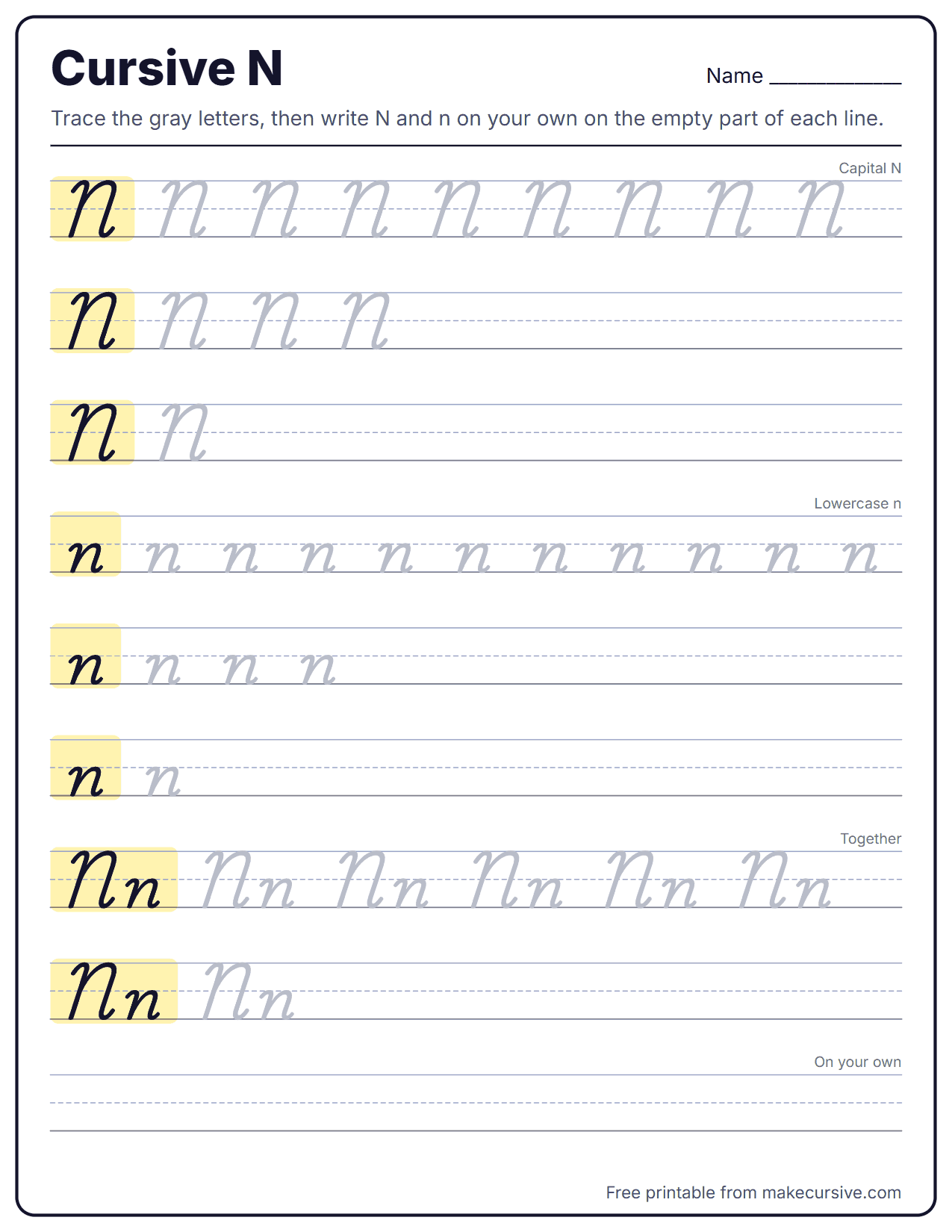
Uppercase, lowercase, and pair examples
Compare the capital N, lowercase n, and the Nn pair before you print or export practice text.
Capital N in cursive
Capital N is the capital M with one stroke fewer. It opens with a small curve at the top line, makes two tall downstrokes joined by a rounded overcurve, and leaves with an undercurve that runs into the next letter.
Capital N stroke steps
- Start just below the top line with a short curve forward, like the top of a cane.
- Slant straight down to the baseline.
- Retrace a little, then overcurve up to the top line in one rounded arch.
- Slant down to the baseline again, parallel to the first stroke.
- Finish with an undercurve that carries straight into the next letter.
Capital N vs capital M
Both letters start the same way. N has two downstrokes and M has three, so the count is the only real difference. If your N keeps growing a third arch, stop after the second downstroke and go straight into the exit.
Common capital N mistakes
- A pointed top on the arch, which reads as a printed N or a V.
- Downstrokes that splay apart instead of staying parallel.
- An exit that stops on the baseline, leaving the next letter floating.
- A capital no taller than the lowercase letters after it.
Lowercase n in cursive
Lowercase n is an overcurve letter, in the same family as m, v, x, y, and z. It stays inside the x-height band, has two rounded tops, and ends with a low undercurve exit.
Lowercase n stroke steps
- Overcurve up from the baseline to the midline and round the top.
- Slant straight down to the baseline.
- Retrace a short way up, then overcurve again to the midline.
- Slant down to the baseline, parallel to the first stroke.
- Undercurve out toward the next letter.
n vs m, u, and r
m is the same letter with a third downstroke, so count them. u is the mirror image: pointed at the top and rounded at the bottom, where n is rounded at the top and pointed at the bottom. A lowercase r has only a small shoulder before its downstroke, so an n with a flat first arch can pass for r.
Common lowercase n mistakes
- A third arch, which turns n into m.
- Pointed tops, which turn n into u.
- A long gap between the two downstrokes, which reads as two separate letters.
- No retrace at the bottom, so the second arch starts from a loop.
Joining n to other letters
The join into n is the overcurve itself, so the letter before n decides how much space the first arch gets. The exit is a plain undercurve at the baseline that suits almost any letter after it.
- in (in, into, line): the i ends in a sharp point. Keep that point and retrace down from it before the n starts its first arch. If the point is rounded, the i and n become three rounded humps, which is an m. Dot the i after the whole word.
- un and nu (nun, union): write the u with pointed tops and the n with rounded tops. When both are rounded, nun reads as mm.
- on, vn, wn (on, gown): o, v, and w end high at the midline, so the n starts from a level bridge and skips the dip of its usual overcurve. The first arch is narrower than normal; keep it rounded.
- nn (inn, dinner): four downstrokes in a row. Space them evenly and keep all tops rounded, or the pair turns into m plus a stray stroke.
- ng (sing, long): the n exit has to climb up and over to start the downcurve of g. Cutting straight across leaves an open g that reads as y.
A4 cursive alphabet practice sheet
Check Nn against the full Aa-Zz alphabet on this A4 preview, then print a focused sheet for counting downstrokes, the in join, and n beside u.
Trace capital N
Write a row of N, then one M at the end and compare the stroke counts.
Trace lowercase n
Count "one, two" on each downstroke so the third never sneaks in.
n and u
Alternate nu nu nu, rounding the n tops and pointing the u tops.
Word lines
Finish with in, into, nine, union, and Nora.
Cursive Alphabet Practice
Practice plan for N
n is one of the most frequent letters in English, so a few days of attention pays off in almost every word you write.
- Count. Open focus practice on N and write a line of lowercase n while saying "one, two" on the downstrokes. Then write one m and say "one, two, three". Repeat with the capitals.
- Points and arches. Make a worksheet of in, un, nu, and nun. Exaggerate the sharp point of i and u and the round tops of n until the difference is obvious from across the room.
- Words. Trace into, nine, union, and evening, then write "Nora's nine nieces sing in unison." from memory and check every n for its count and its tops.
For the shortest possible drill, write iiii, then nnnn, then in in in, one minute each. It trains the join that causes the most trouble without turning into a long session.
Practice words for N
Each word puts n after a different kind of letter or repeats it so the count gets tested.
For a printed reference of the whole alphabet, use the cursive alphabet worksheets. The blog post on fixing a cursive n that looks like m or u has an animated stroke preview.
Decorative capital N for names and monograms
For a monogram, a wedding place card, or a tattoo initial, people usually want a more decorative N than the school form. The generator's image fonts give you that range; a few checks keep the result readable.
Check it at the real size
Hairline flourishes vanish on a small profile icon and blur in a small tattoo. Export the N as a PNG and view it at the size it will actually be used before you decide.
Capital alone or in a name
A single capital N suits monograms and initials. Inside a name, a heavily looped N can crowd the next letter, so preview the whole name, such as Nora or Nathan, not just the initial.
Copyable text or an image
Copy-and-paste script N works in bios and captions, but apps draw it with their own fonts. When the exact look matters, as on a card or a stencil, use an image export instead.
Cursive N questions
How many humps does a cursive n have?
Count downstrokes rather than humps. Lowercase n has two: the entry overcurve makes the first rounded top, a second overcurve makes the next one, and each drops straight to the baseline. Lowercase m has three. If you count only the arch after the entry stroke, n has one and m has two, which is the same rule.
Why does my cursive "in" look like "m"?
The i ends at a sharp point and the n begins with rounded tops. When the point of the i gets rounded too, the i and n together make three rounded humps, which is exactly what an m looks like. Keep the i point sharp, retrace down from it, and add the dot after the word.
How do I keep n from looking like u?
Look at where the points are. n is rounded at the top and pointed at the bottom; u is pointed at the top and rounded at the bottom. If both letters are rounded everywhere, words like nun, run, and union become unreadable.
Does capital N join the next letter?
In most American school models it does: the final undercurve of capital N leads straight into the next lowercase letter, as in Nora or Nathan. Some decorative styles end N with a flourish and start the next letter separately.
Can I use a decorative N for a monogram or tattoo?
Yes, but check it at the real size. Thin hairline flourishes disappear on small icons and blur in small tattoos. Export the N from the generator as a PNG and look at it at the size it will actually be used.
How other handwriting models draw N
These steps follow the common American school model. Palmer-era copybooks often open capital N with a large loop, D'Nealian starts it with a simple downstroke, and some UK joined styles write lowercase n with an angular top and no entry overcurve when it starts a word.